App Icon Design Best Practices
Your app icon is the very first thing users see before they even open your app. In today’s crowded digital marketplace, this small image has a big job. It can decide whether people stop to explore your app or scroll past it. A strong icon works as a brand ambassador and a silent salesperson, shaping how users view your product from the very first glance.
But here is the challenge. With millions of apps in the stores, creating good app icons that stand out is not easy. Many designers and developers struggle to balance beauty with strict platform rules. Others are unsure how much an icon affects our App Store Optimization strategy and user acquisition. These gaps in understanding often lead to icons that blend in instead of standing out, costing apps valuable downloads and recognition.
The good news is that there is a clear path forward. This guide will walk you through the art and science of app icon design with practical steps, expert insights, and real-world examples. You will learn how to make smart design choices, follow platform requirements, and create icons that not only look attractive but also help your app grow.
Core Principles of Effective App Icon Design
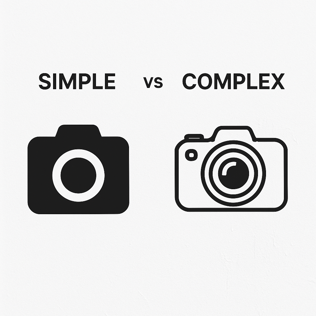
Simplicity: The Foundation of Recognition
A truly effective app icon communicates its purpose instantly without clutter. The best app icons are simple, clear, and easy to recognize on any screen size.
Expert Tip: A complex design often confuses users. Focus on one clear shape or symbol that people can identify right away.
Clarity in Concept
Icons work best when they focus on a single, dominant idea. For example, if your app is about notes, a paper or pen symbol is more effective than trying to show multiple objects. Great app icons turn one big idea into a visual metaphor.
Eliminating Distractions
Every extra line or unnecessary detail makes the icon harder to read. Stick to bold shapes, limited colors, and a clean background. Following app store icon design guidelines helps you ensure scalability and consistency.
Practical Guidance for Designers
Write down your app’s purpose in one short line.
List 2–3 symbols that match this purpose.
Choose the strongest one and sketch it in simple shapes.
Test the design at different sizes to confirm readability.
Compare it against popular app logos to see how well it stands out.
When you design app icons with clarity and simplicity, they not only look good but also improve user trust and recognition.
Ready to create a standout identity for your app? At Logisol Technologies, we help you design app icons that combine creativity with strategy to boost visibility and user acquisition.
Recognizability: Making Your Mark Memorable
Your app icon should be instantly recognizable, even in a quick glance. When users scroll through an app store, recognizable designs have a much higher chance of being clicked compared to generic ones.
Unique Content Idea: Try an “Icon Challenge” with your team. Show a set of well-known icons next to plain, generic ones and see which are instantly identified. This exercise shows the power of strong app icons design.
Distinctive Imagery Use unique shapes, colors, or motifs that reflect your brand identity. Avoid overused symbols or common clipart that make your app look like many others.
Avoiding Generic Stock Imagery Stock visuals may save time, but they often blend into the crowd. Your goal is to stand out, not to disappear among sample app icons.
Cognitive Psychology Insight Principles like Gestalt’s Law of Pragnanz (simplicity) and Figure-Ground (clear separation between object and background) can make your icon easier for the brain to process, helping users remember it faster.
Uniqueness: Standing Out from the Crowd
In a saturated marketplace, uniqueness is more than a style choice—it’s survival. A distinctive icon strengthens your brand and makes it easier for users to associate it with your product.
Competitor Analysis: Study what works in your niche, but don’t copy. Notice trends in best application icons and identify what makes them effective.
Developing a Signature Style: Add a touch of personality to your design. This might come through a custom shape, a bold color choice, or subtle visual storytelling.
Expert Tip: Look at competitor designs to learn, not to imitate. Uniqueness is what sets apart great app icons from forgettable ones.
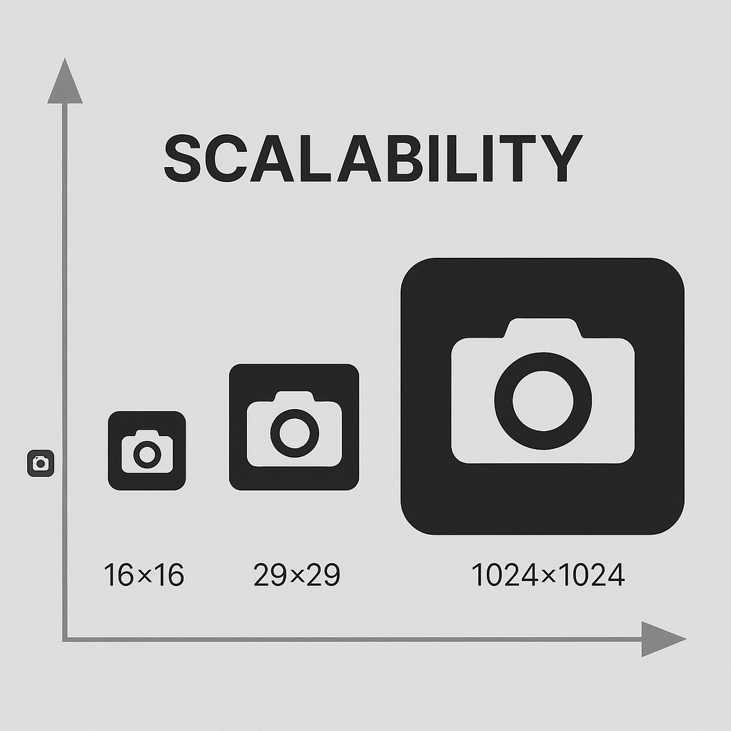
Scalability: Flawless Across All Sizes
An app icon must work across many devices—from tiny smartwatch displays to large monitors. A design that looks good only at 512 px but fails at 24 px will hurt your app’s visibility.
Design Small First: Start by designing for the smallest size, then scale up. If it’s legible in its tiniest form, it will shine at larger resolutions.
Vector vs Raster: Always design in vector format. This ensures your software app icon scales smoothly without losing quality.
Critical Details: Avoid fragile details like thin lines or tiny gradients. They disappear when scaled down.
Expert Tip: Optimize for the smallest size first, then expand. This way, your icon remains sharp and functional in every context—whether on a home screen, app store listing, or notification panel.
A memorable, unique, and scalable app icon is not just good design—it’s smart branding.
Want help crafting an icon that users recognize and remember? Contact us for assistance. Logisol Technologies specializes in designing custom logo app icon solutions that balance creativity, clarity, and performance.
Consistency: Reinforcing Brand Identity
An app icon should never feel separate from your brand. It is not just a decorative image but a reflection of your values, design style, and functionality. Consistency between your icon, app interface, and overall branding helps build trust and recognition.
Brand Guidelines Integration Always check your brand guidelines when designing icons for app design. Colors, typography, and visual styles should connect with your website, marketing materials, and in-app experience.
Thematic Cohesion A user should feel the same tone and mood when looking at your icon as they do when using your app. For example, a finance app should have a stable and trustworthy design, while a game might have brighter, playful imagery.
Expert Tip: Maintain brand consistency. Your app icon is a vital part of your identity, so align it with your visual language and overall brand story.
Dissecting the Elements: Color, Shape, Imagery, and Typography
Color Psychology: More Than Just Hues
Colors speak before words. They trigger emotions and set expectations.
Emotional Associations: Blue suggests trust and reliability, red signals urgency and passion, green reflects growth or wellness.
Color Palettes: Use cohesive color schemes that match your brand. A mix of 2–3 colors usually works best for clarity.
Contrast and Vibrancy: Icons with strong contrast stand out more in crowded stores, making them closer to awesome app icons that users notice instantly.
Insight: Studies show that apps with higher color contrast in icons have better click-through rates, especially in categories like shopping and lifestyle.
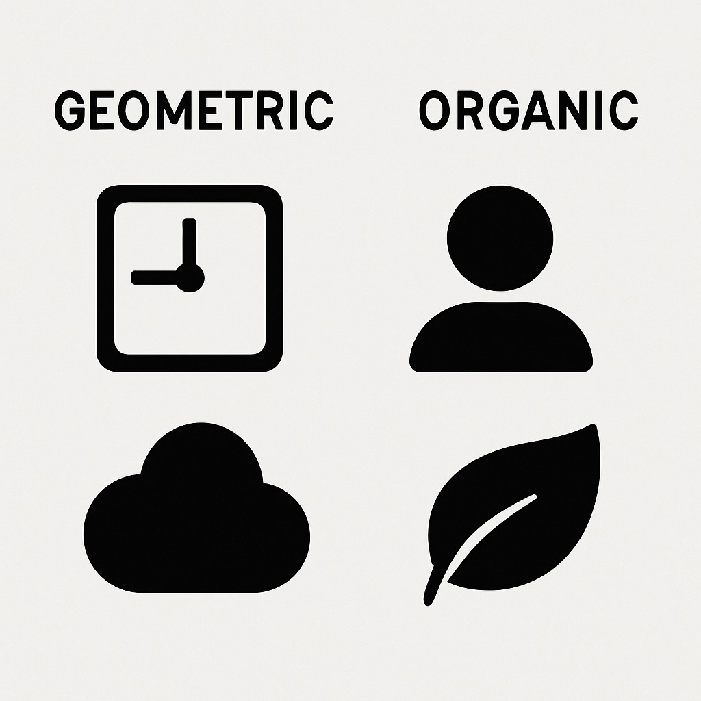
Shapes and Forms: The Geometric and the Organic
Shapes give structure to an icon. They carry meaning even before a user understands the details.
Geometric Shapes: Squares and triangles suggest order, stability, and modern design.
Organic Shapes: Curves and freeform outlines feel friendly, approachable, and human.
Negative Space: Leaving intentional empty areas can make your icon cleaner, sharper, and easier to recognize.
Expert Tip: Leverage negative space effectively. Sometimes what you leave out adds more power than what you put in.
Unique Content Idea: An “Icon Anatomy” breakdown where users can interact with example designs—clicking on background, shapes, or colors to see their meaning—can make learning both engaging and memorable.
When color and shape are chosen with purpose, your app icon becomes more than a graphic. It becomes a story your users understand without reading a word.
At Logisol Technologies, learn more about us and our design experts create app store icon design solutions that balance psychology, branding, and usability to ensure your app gets noticed.
Imagery and Symbolism: The Heart of Your Icon
At the center of every successful app icon is an image that tells a story. The central graphic element should reflect your app’s purpose and brand personality in a way that feels clear and memorable.
Illustrative vs. Abstract Some apps benefit from literal imagery, like a camera for photography or a chat bubble for messaging. Others use abstract designs to spark curiosity and represent broader ideas. Both can work, but the key is consistency and relevance.
Metaphorical Representation Symbols are powerful. A simple lock can represent security, while a flame can show energy or passion. The best app icon designs use metaphor to explain complex functions in a simple way.
Cultural Nuances in Imagery Be mindful of culture when choosing symbols, colors, or shapes. An image that feels positive in one culture may have a completely different meaning in another.
Expert Tip: Always research your target audience’s cultural context before finalizing your icon. What looks like good app icons in one region might fail in another.
Typography: When (and How) to Use Text
Text in icons is often discouraged, but in some cases, it can reinforce brand recognition.
Legibility at Small Sizes: Text is the first thing to blur when scaled down. If you must use it, keep it short, bold, and minimal.
Brand Integration: Custom fonts can work when they are already central to your branding. For example, a single letter logo can succeed if it’s strongly tied to your brand identity.
Expert Tip: Use text sparingly. Most of the best app logos rely on strong imagery rather than words.
Platform-Specific Guidelines: iOS vs. Android
Every platform has rules that you must follow, and ignoring them can hurt your app’s acceptance or user experience.
Apple’s Human Interface Guidelines: Apple emphasizes polished, unified designs. Their icons traditionally leaned toward skeuomorphism (realistic visuals), though now they favor clean and minimal styles. See Apple’s App Icon Guidelines.
Google’s Material Design Guidelines: Google prefers flat, bold designs that work across different devices. Adaptive icons allow your now mobile app icon to change shape while keeping its core consistent. See Google’s Icon Design Guidelines.
Icon Grid Systems: Both platforms encourage designers to use grid layouts for balance and alignment, ensuring icons feel polished and professional.
Expert Tip: Design adaptive icons for Android and grid-aligned icons for iOS. Respecting platform rules helps you achieve consistency and ensures smooth app approval.
With the right imagery, careful use of text, and respect for platform guidelines, your app icon can communicate value, stand out, and build trust with users across every device.
At Logisol Technologies, our design experts follow both Apple and Google standards to craft best app icons that work beautifully on every platform.
Comparative Table: iOS and Android App Icon Guidelines
Attribute | Apple iOS Guidelines | Google Android Guidelines | Key Differences | Best Practice Recommendation |
|---|---|---|---|---|
Shape | Fixed rounded square (system-defined corner radius). | Adaptive icons that can appear as circle, square, squircle, or teardrop depending on device launcher. | iOS uses a fixed shape; Android allows dynamic shapes. | Design with a centered focal element that works well inside multiple masks. |
Size (Display) | Multiple sizes (e.g., 60×60pt for home screen, 1024×1024px for App Store). | Multiple sizes (e.g., 48dp for launcher, 512×512px for Play Store). | Both use different scaling systems; Android requires larger safe zones. | Start with the largest required size (1024px/512px) and scale down to test clarity at smaller sizes. |
Layers | Single flat layer. | Foreground and background layers for adaptive icons. | Android supports depth and movement with two layers. | Use simple background + focused foreground to ensure clarity across devices. |
Shadows/Depth | Minimal or no shadows; prefers flatter look. | Subtle long shadows or material elevation effects allowed. | Android embraces depth; iOS prefers flat visuals. | Use very light depth only when needed—avoid over-stylization. |
Text | Strongly discouraged. Rarely used. | Strongly discouraged due to adaptive masks. | Both discourage text, Android even more so. | Avoid text; rely on bold imagery or a single branded letter. |
Bevels/Borders | Avoid external borders or bezels. | Avoid frames or borders; use full-bleed design. | Both recommend clean, border-free icons. | Let your background color or gradient act as a natural frame. |
Perspective | Flat, front-facing view. | Flat, front-facing view. | No difference. | Stick with flat perspective—3D or angled views are outdated. |
Padding/Safe Zone | Must fit within Apple’s defined icon grid. | Foreground should remain within 33% safe zone to allow masking. | Android requires stricter safe zone adherence. | Leave breathing room around the focal element to prevent clipping. |
Transparency | Not supported in final asset. | Not supported in final asset. | No difference. | Always use solid backgrounds—no transparent layers. |
Corner Radius | System applies a fixed mask (about 20% of size). | Corner radius changes with mask shape (circle, squircle, etc.). | iOS corner radius fixed; Android variable. | Keep edges simple so the system-applied radius looks clean. |
Designing an app icon is not just about drawing a pretty picture. It’s about strategy, clarity, and consistency. Below is a complete step-by-step process you can follow to create effective and good app icons that stand out in crowded stores.
Phase 1: Brainstorming and Ideation
Start by defining what your app stands for. Ask yourself: What is the main function, who is the target audience, and what brand values should the icon reflect?
Keyword Association: Write down words related to your app’s purpose. For example, a fitness tracker might link to strength, energy, or motion.
Mood Boards: Collect references from best application icons or visual inspiration from design galleries.
Differentiation Opportunity: Interview or follow insights from professional designers to understand how they begin their concept phase.
Phase 2: Sketching and Wireframing
Translate raw ideas into tangible visuals through quick sketches.
Rapid Sketching: Draw several small variations instead of perfecting one.
Thumbnail Sketches: Check how they look at smaller sizes early in the process.
Composition: Focus on balance and proportions before adding details.
Consideration: Follow a structured process. Start rough, refine gradually, and narrow down to the strongest idea.
Phase 3: Digital Creation and Refinement
Once sketches are solid, move to digital design tools.
Vector Graphics: Tools like Adobe Illustrator or Affinity Designer are essential for scalability when creating logo app icon designs.
Grids and Proportions: Use guides to maintain symmetry.
Color and Texture: Apply bold palettes and subtle depth using Photoshop or Procreate.
Expert Tip: Vectors ensure your sample app icon remains sharp at all sizes, from a smartwatch to a tablet.
Phase 4: Testing and Iteration
An icon may look great on a large monitor but fail on a small device.
Test on Devices: Preview on phones, tablets, and watches.
User Feedback: Share designs with diverse groups for fresh perspectives.
A/B Testing Preparation: Get ready to test variations.
Expert Tip: Collect feedback early and refine quickly. This avoids wasted time on designs that don’t scale well.
Phase 5: Exporting and Submission
Now it’s time to prepare assets for publishing.
Platform Assets: Create all required sizes for iOS and Android.
Naming Conventions: Keep files organized for submission.
Final Quality Check: Verify against platform rules for app store icon design.
Differentiation Opportunity: Provide your team with an interactive checklist to confirm readiness before submission.
Your icon plays a direct role in how users discover and download your app. It influences impressions, tap-through rates, and overall installs.
Visual Appeal: A polished software app icon grabs attention in search results.
Conversion Funnel: The icon acts as the first gateway, moving users from glance to download.
Beyond Pixels: Think of icons as performance drivers, not just decorations.
A/B Testing Your App Icon for Performance
Guesswork is risky. Testing helps you find the design users respond to most.
Set Up Tests: Use tools within the Play Store and App Store.
Track Metrics: Watch impressions, tap-through rate, and downloads.
Interpret Results: Adjust based on real data.
Expert Tip: Use A/B testing to compare app icon text variations, colors, or shapes. Data will tell you which one performs best.
Competitor Analysis and Market Trends
Learning from competitors helps you stay relevant while carving your own space.
Visual Trends: See what’s working for popular app logos in your niche.
Differentiation: Identify gaps where you can stand out.
Localization: Adapt your best app icon for cultural relevance in different markets.
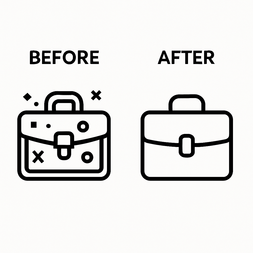
Common App Icon Design Mistakes to Avoid
Even strong ideas can fail if executed poorly.
Clutter: Trying to show too many details leads to confusion. Remember, the design app icons rule of thumb is “less is more.”
Inconsistent Branding: Icons that don’t match your app’s UI break trust.
Ignoring Scalability: Overly complex designs fail when resized.
Quick Fix: Always prioritize clarity, scalability, and brand alignment.
Designing effective app icons design is about balancing creativity with function. From brainstorming to testing, every step matters.
At Logisol Technologies, we specialize in creating icons for app design that merge beauty with strategy. Whether you want awesome app icons or need to know how to design an app icon that boosts visibility, our team helps you craft visuals that drive engagement and downloads.
Common App Icon Mistakes to Avoid
Even talented designers can make errors that weaken their icon’s impact. Recognizing these pitfalls will save you from creating icons that fail to perform.
Poor Contrast or Illegible Typography
An icon must be clear on every device, under every lighting condition.
Color Accessibility: Always ensure strong contrast so your icon works for all users, including those with visual impairments.
Font Choice Pitfalls: Using small or decorative fonts often leads to unreadable results. This is why design app icons should rarely rely on text.
Lack of Uniqueness or Generic Imagery
Blending in means being forgotten.
Avoiding Clichés: Symbols like gears, globes, or speech bubbles are overused.
The Importance of Originality: A unique approach, even with a simple shape, helps you compete with best app icons in your category.
Ignoring Platform Guidelines
Failing to follow Apple’s or Google’s standards not only risks rejection but also hurts user experience.
The Cost of Non-Adherence: App store rejections can delay your launch.
Adaptive Icon Misunderstandings: Many designers forget Android’s safe zones, leading to cut-off or distorted app store icon design.
Not Testing on Real Devices
What looks stunning on a large monitor might fail on a small phone.
The Monitor Illusion: Icons may appear sharp on a design canvas but blur on real devices.
Simulating Conditions: Always test in varied environments—dark mode, sunlight, and low brightness.
Case Studies: Icons That Soared (and Sank)
Learning from real-world examples provides clarity on what works and what doesn’t.
Anatomy of Successful App Icons
Icon That Soared – Example 1: Instagram
Design Choices: A clean camera outline with a bold gradient background.
Psychological Impact: Bright, warm colors trigger energy and positivity.
Impact on Performance: Its redesign boosted recognition, helping Instagram become one of the most popular app logos worldwide.
Icon That Soared – Example 2: Spotify
Design Choices: A simple circle with three curved sound waves.
Psychological Impact: Minimalist form plus green-black palette communicates energy and trust.
Impact on Performance: Its awesome app icons branding is now instantly tied to streaming music globally.
Lessons from Icons That Missed the Mark
Icon That Sank – Example 1: Generic Weather App
Design Flaws: Tried to show sun, clouds, rain, and temperature in one design.
Negative Perception: Users found it cluttered and hard to recognize.
Missed Opportunity: A single bold sun or cloud would have improved recognition and downloads.
Icon That Sank – Example 2: Early Android Utility Apps
Design Flaws: Used low-quality raster graphics, poor scalability, and ignored adaptive shapes.
Negative Perception: Icons looked outdated and unprofessional.
Missed Opportunity: A vector-based what is an application icon approach would have created sharper results and built user trust.
Avoiding mistakes and studying real-world examples gives you the roadmap to design good app icons that attract attention and drive installs.
At Logisol Technologies, we analyze market trends and case studies to create best practices icon solutions. Whether you want to redesign or launch a new app icons design, our team ensures your brand stands out and performs.
Tools and Resources for App Icon Designers
Essential Graphic Design Software
To design great app icons, you need the right tools. Professional software makes it easier to create scalable, polished icons that work across platforms.
Adobe Illustrator: Best for vector-based artwork, ensuring your icon stays sharp at every size.
Figma: Ideal for collaborative app icons design, prototyping, and testing variations with teams.
Sketch: A Mac-based favorite among UI/UX designers working on app store icon design.
Affinity Designer: A budget-friendly but powerful alternative to Illustrator.
Procreate: Excellent for sketching and illustration, especially on iPad.
Icon Management and Prototyping Tools
Efficient workflows matter when working on multiple versions or testing variations.
IconJar: Organize, search, and export your design app icons with ease.
Mock-up Generators: Place your icon into device frames to preview how it looks on real screens.
A/B Testing Platforms: Test different versions directly within app stores to see which drives better results.
Online Resources and Learning
Staying updated is essential for creating best practices icon solutions.
Design Communities: Join forums and groups for peer feedback and inspiration.
Tutorials and Courses: Master tools and refine design skills step by step.
Official Guidelines: Always review Apple’s Human Interface Guidelines and Google’s Material Design Icons Guide to ensure compliance.
Future Trends in App Icon Design
App icon design is not fixed—it evolves as technology and user habits change.
The Evolving Canvas
Adaptive Icons Beyond Android: Expect more platforms to allow flexible shapes.
Dark Mode Considerations: Icons must look sharp in both light and dark themes.
Cross-Platform Cohesion: Creating a software app icon that works seamlessly across iOS, Android, and web is key.
Forward Insight: Animated icons, subtle gradients, and even lightweight 3D elements are emerging trends. Start designing with these possibilities in mind to future-proof your icons.
Personalization and Dynamic Icons
Tomorrow’s icons may adapt in real time:
User-Configurable Elements: Allow limited customization for brand or mood.
Contextual Icons: Change appearance based on time, location, or app state.
Micro-Animations and 3D Elements
Motion and depth can make icons more engaging when used carefully.
Subtle Motion: Small loops or highlights can draw attention without being distracting.
3D Elements: A cautious use of depth adds realism but should not compromise clarity at small sizes.
With the right tools, resources, and future-focused mindset, you can create icons that perform today and remain relevant tomorrow.
At Logisol Technologies, we combine creativity and strategy to design best app logos and icons that are not only visually stunning but also ready for future platforms and trends.
Conclusion: Your Icon’s Journey to Stardom
You’ve now explored the complete journey of app icon design — from brainstorming to testing, from avoiding mistakes to preparing for future trends. Along the way, you’ve seen how a simple square of pixels can shape user behavior and even define your brand’s identity.
Recap of Key Takeaways
The Power of Simplicity: Clear, memorable icons are the most effective.
Platform-Specific Mastery: Following iOS and Android guidelines is essential for approval and consistency.
Data-Driven Decisions: A/B testing helps you choose icons that convert, not just those that look good.
Continuous Improvement: Iteration ensures your design stays relevant as user expectations evolve.
Your Icon, Your Legacy
An app icon is not just decoration. It is your brand’s face in the digital world, a reflection of your values, and the very first promise you make to users. By applying the principles and strategies in this guide, you’re not only creating an icon — you’re building a symbol that inspires trust, grabs attention, and fuels downloads.
Final Encouragement
Design is never truly finished. Test often, refine with care, and embrace the iterative process. Every pixel matters, and with the right focus, your icon can rise above the crowd and become unforgettable.
At Logisol Technologies, we help businesses and creators transform ideas into best app icons that boost visibility, strengthen brand identity, and engage users worldwide. Your icon’s journey to stardom starts here — let’s design it together.
Logisol
Technologies
Founded in 2024, Logisol is a trusted tech company delivering innovative digital solutions and cutting-edge web development services.
Read MoreMobile App Development